Benchmark tasks are a cornerstone of ML research, and a large proportion new research in pretty much every subfield follows the following template:
- Introduce new layer, architecture, optimiser, inference scheme…
- Run the model on a set of benchmark tasks
- Make a big table with your model/method and a load of other similar ones1
Although this paradigm has some issues, it can be a useful way of doing things. It has arguably driven at least some of the progress we have seen in recent years by making it easy for researchers to quickly iterate without worrying too much about applications.
The success of this paradigm hinges on one crucial principle: the benchmark tasks must be a good proxy for things people actually care about in the real world. If they aren’t, what’s the point? ML’s only value is in its ability to solve real world problems.
While benchmarks in CV and NLP for the most part seem to be a reasonable proxy for real world tasks, time series forecasting (TSF) benchmarks have become increasingly disconnected. Models are often evaluated on tasks that either do not reflect realistic scenarios or fail to reveal meaningful distinctions between methods.
Exchange rates
A prime example is the exchange rates dataset, which consists of 10,000 daily rates from 8 currency pairs, which appears in many recent and historical papers.2 The task is to predict up to 2 years (~720 time steps) into the future, using only the past values of the series as inputs.

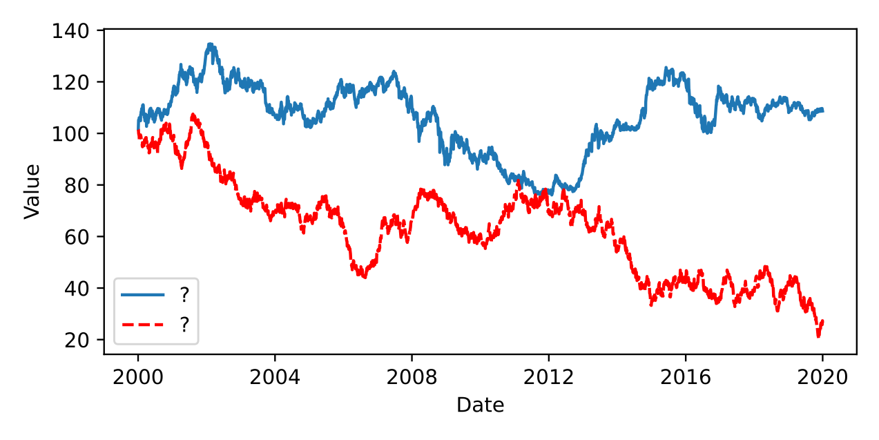
Can you spot the random walk?
The plot above shows one component of the exchange dataset, along with a random walk with the same mean and variance. They look extremely similar.3 This is because the path of exchange rates can be very well approximated with a random walk. This means that the optimum forecast is, in most cases, simply the last observed value (also known as persistence). The past values of the series are not predictive beyond the last observation. There is some evidence to suggest that if additional macroeconomic variables are included forecasts can beat persistence but, unfortunately, these are not included in the benchmark.4
This benchmark does not correspond in any way to any problem in the real world. People interested in modelling exchange rates would never do it this way, because it doesn’t really make any sense. You are just fitting noise. The fact this benchmark is so common in the literature is revealing, and shows a disconnect between forecasting research and forecasting practice. Many TSF papers neglect to include persistence as a baseline.5 This makes it impossible to tell if the results for the proposed model on the exchange data are skilful. Nevertheless, the results are still often used as evidence that the model is performant relative to others. Unfortunately this is just one example of poor benchmarking practice in TSF research.
Getting the setup wrong
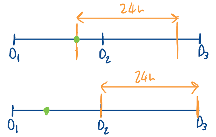
One task I know a little bit about, due to my former line of work, is electricity price forecasting (EPF). This has become a reasonably common benchmark in TSF papers over the past few years. On the whole, it is not a bad benchmark, although the predictability of prices beyond simple seasonality from past values alone (without exogenous variables) is perhaps debatable. EPF does however have quite a specific setup. In Europe, most power is traded on the day before delivery, at an auction. This auction typically occurs around 12:00. Market participants are interested in a forecast for the price of the next days power before this auction occurs, which they can use to inform their bids.6 This means the forecast should be produced once a day with a window size of 24, and an offset of 12. Unfortunately, this is not how the benchmark is used (see e.g. TimeXer), where the window size is correctly set to 24, but offset is set to 0 and predictions are made on a rolling basis every hour. The diagram below shows the difference between these setups.

Prediction point (green dot), and forecast window (orange lines) for electricity price forecasting task. Top shows benchmark setup, bottom shows realistic setup.
This may seem like a small difference, but it is revealing of the prevailing attitudes in the field, which is to not really consider the downstream use of models. Frustratingly, the correct setup is discussed in the paper the authors of TimeXer cite as the source of the dataset for the benchmark. I have only picked up on this particular discrepancy because it is a problem I just happen to know about. Other members of our group at UCL have discussed similar issues with the common flu rates benchmark. It is likely that these issues are present in other benchmarks as well.
Reporting of metrics
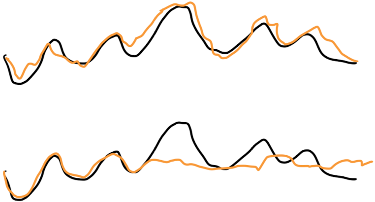
In the vast majority of recent papers, the reported metric is the average error over the forecast horizon. Say we have a forecast horizon of 100, then for each time point, our model outputs a vector of size 100, giving the prediction for each element of the horizon. The error is then computed relative to the target, and averaged over the 100 steps. Whilst this may be a useful metric in some contexts, it does not by any means give the full story of the performance of a model. Consider the two forecasts below.

True series (black) and forecast (orange) for single example for two different models. These models will have the same error for this example.
These forecasts have the same error, but are very different. The top has moderate skill over the whole window, and the bottom is very skilful initially, and then not at all for the remainder. If we are interested in the error for prediction 100 steps into the future, the one model is useful and one is not. The way the error is reported however makes it impossible to know if forecasts are skilful a long horizons, or simply do well at the start of the horizon and are random after. This is compounded by the fact that as, mention above, the error of persistence is rarely reported making it hard to know what the error for a skilful forecast should be.
Concluding thoughts
In TSF, unlike in other areas of ML which are dominated by Transformer architectures, there is not one model which has been shown to do best across tasks. It is not a guarantee that creating a fancier architecture with more parameters is going to give better performance. In fact linear models have been shown to rank best on average over a diverse set of datasets. That is not to say that sophisticated architectures can never be useful, because they can, but deploying them effectively in the real world requires understanding when they work and when they don’t. Using unrealistic benchmarks hinders this understanding and slows progress in the field. We should try to do better!
-
If you want it to get accepted, you’ll need to make sure your model is all bold. ↩︎
-
Random sample from my Zotero: ProbTS, Chronos, UniTS, iTransformer, (D/N)Linear, Autoformer ↩︎
-
Red (bottom) is random walk, blue (top) is Yen/USD. ↩︎
-
This is not the entire story, you can actually do better than this sometimes if you use something called a purchasing power power parity model, which compares the price of a basket of goods in each county, then does some economics on it. This survey looks at 42 methods from the liturature. ↩︎
-
A few recent examples: UniTS, iTransformer, Autoformer ↩︎
-
It is also possible to trade outside the auction, on the spot market. The spot market usually will only have liquidity for a few hours before the delivery of the contract. In that case the forecast horizon is 1 or 2 time steps, so it is really quite a different problem, albiet one that is also not discussed in any of the benchmarks. ↩︎